DataTable2
Examples#
Example 1#
import flet as ft

import flet_datatable2 as fdt


def main(page: ft.Page):
    page.add(
        fdt.DataTable2(
            empty=ft.Text("This table is empty."),
            columns=[
                fdt.DataColumn2(label=ft.Text("First name")),
                fdt.DataColumn2(label=ft.Text("Last name")),
                fdt.DataColumn2(label=ft.Text("Age"), numeric=True),
            ],
        ),
    )


ft.run(main)
Example 2#
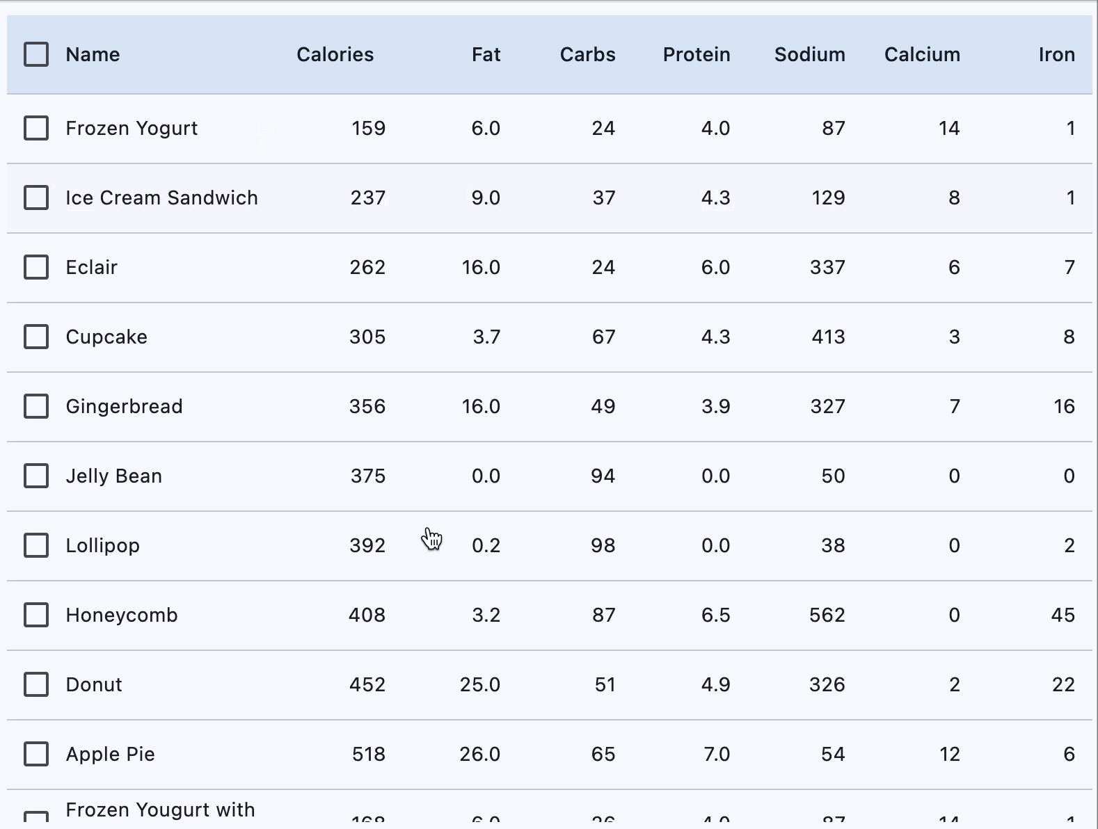
import flet as ft
from data import desserts

import flet_datatable2 as ftd


def main(page: ft.Page):
    page.vertical_alignment = ft.MainAxisAlignment.CENTER
    page.horizontal_alignment = ft.CrossAxisAlignment.CENTER

    def handle_row_selection_change(e: ft.Event[ftd.DataRow2]):
        e.control.selected = not e.control.selected
        e.control.update()

    def sort_column(e: ft.DataColumnSortEvent):
        print(f"Sorting column {e.column_index}, ascending={e.ascending}")

    def get_data_columns():
        data_columns = [
            ftd.DataColumn2(
                label=ft.Text("Name"),
                size=ftd.DataColumnSize.L,
                on_sort=sort_column,
                heading_row_alignment=ft.MainAxisAlignment.START,
            ),
            ftd.DataColumn2(
                label=ft.Text("Calories"),
                on_sort=sort_column,
                numeric=True,
                heading_row_alignment=ft.MainAxisAlignment.END,
            ),
            ftd.DataColumn2(
                label=ft.Text("Fat"),
                on_sort=sort_column,
                numeric=True,
            ),
            ftd.DataColumn2(
                label=ft.Text("Carbs"),
                on_sort=sort_column,
                numeric=True,
            ),
            ftd.DataColumn2(
                label=ft.Text("Protein"),
                on_sort=sort_column,
                numeric=True,
            ),
            ftd.DataColumn2(
                label=ft.Text("Sodium"),
                on_sort=sort_column,
                numeric=True,
            ),
            ftd.DataColumn2(
                label=ft.Text("Calcium"),
                on_sort=sort_column,
                numeric=True,
            ),
            ftd.DataColumn2(
                label=ft.Text("Iron"),
                on_sort=sort_column,
                numeric=True,
            ),
        ]
        return data_columns

    def get_data_rows(desserts):
        data_rows = []
        for dessert in desserts:
            data_rows.append(
                ftd.DataRow2(
                    specific_row_height=50,
                    on_select_change=handle_row_selection_change,
                    cells=[
                        ft.DataCell(content=ft.Text(dessert.name)),
                        ft.DataCell(content=ft.Text(dessert.calories)),
                        ft.DataCell(content=ft.Text(dessert.fat)),
                        ft.DataCell(content=ft.Text(dessert.carbs)),
                        ft.DataCell(content=ft.Text(dessert.protein)),
                        ft.DataCell(content=ft.Text(dessert.sodium)),
                        ft.DataCell(content=ft.Text(dessert.calcium)),
                        ft.DataCell(content=ft.Text(dessert.iron)),
                    ],
                )
            )
        return data_rows

    page.add(
        ftd.DataTable2(
            show_checkbox_column=True,
            expand=True,
            column_spacing=0,
            heading_row_color=ft.Colors.SECONDARY_CONTAINER,
            horizontal_margin=12,
            sort_ascending=True,
            bottom_margin=10,
            min_width=600,
            on_select_all=lambda e: print("All selected"),
            columns=get_data_columns(),
            rows=get_data_rows(desserts),
        ),
    )


ft.run(main)
Bases: DataTable
Extends flet.DataTable.
Provides sticky header row, scrollable data rows,
and additional layout flexibility with DataColumn2
and DataRow2.
Note
DataTable2 doesn't support
DataTable.data_row_min_height
and DataTable.data_row_max_height
properties present in the parent DataTable.
Use data_row_height instead.
animate_align: AnimationValue | None = None
animate_margin: AnimationValue | None = None
animate_offset: AnimationValue | None = None
animate_opacity: AnimationValue | None = None
animate_position: AnimationValue | None = None
animate_rotation: AnimationValue | None = None
animate_scale: AnimationValue | None = None
bottom: Number | None = None
The distance that the child's bottom edge is inset from the bottom of the stack.
Note
Effective only if this control is a descendant of one of the following:
Stack control, Page.overlay list.
Alignment of the checkbox.
checkbox_horizontal_margin: Number | None = None
Horizontal margin around the checkbox, if it is displayed.
clip_behavior: ClipBehavior = NONE
Defines how the contents of the table are clipped.
col: ResponsiveNumber = 12
If a parent of this control is a ResponsiveRow,
this property is used to determine
how many virtual columns of a screen this control will span.
Can be a number or a dictionary configured to have a different value for specific
breakpoints, for example col={"sm": 6}.
This control spans the 12 virtual columns by default.
/// details | Dimensions type: info | Breakpoint | Dimension | |---|---| | xs | <576px | | sm | ≥576px | | md | ≥768px | | lg | ≥992px | | xl | ≥1200px | | xxl | ≥1400px | ///
column_spacing: Number | None = None
The horizontal margin between the contents of each data column.
data_row_checkbox_theme: CheckboxTheme | None = None
Overrides theme of checkboxes in each data row.
data_row_color: ControlStateValue[ColorValue] | None = None
The background color for the data rows.
The effective background color can be made to depend on the
ControlState
state, i.e. if the row is selected, pressed, hovered, focused, disabled or enabled.
The color is painted as an overlay to the row. To make sure that the row's InkWell
is visible (when pressed, hovered and focused), it is recommended to use a
translucent background color.
disabled: bool = False
Every control has disabled property which is False by default - control and all
its children are enabled.
Note
The value of this property will be propagated down to all children controls recursively.
/// details | Example type: example For example, if you have a form with multiple entry controls you can disable them all together by disabling container:
///
divider_thickness: Number = 1.0
The width of the divider that appears between rows.
Note
Must be greater than or equal to zero.
expand_loose: bool = False
Allows the control to expand along the main axis if space is available, but does not require it to fill all available space.
More information here.
fixed_columns_color: ColorValue | None = None
Background color for sticky left columns.
fixed_corner_color: ColorValue | None = None
Background color of the fixed top-left corner cell.
fixed_left_columns: int = 0
Number of sticky columns on the left. Includes checkbox column, if present.
fixed_top_rows: int = 1
Number of sticky rows from the top. Includes heading row by default.
heading_checkbox_theme: CheckboxTheme | None = None
Overrides theme of the heading checkbox.
heading_row_color: ControlStateValue[ColorValue] | None = (
    None
)
The background color for the heading row.
The effective background color can be made to depend on the
ControlState state, i.e. if the row is pressed, hovered,
focused when sorted. The color is painted as an overlay to the row. To make sure
that the row's InkWell is visible (when pressed, hovered and focused), it is
recommended to use a translucent color.
heading_text_style: TextStyle | None = None
The text style for the heading row.
horizontal_lines: BorderSide | None = None
Set the color and width of horizontal lines between rows.
horizontal_margin: Number | None = None
The horizontal margin between the edges of the table and the content in the first and last cells of each row.
When a checkbox is displayed, it is also the margin between the checkbox the content in the first data column.
left: Number | None = None
The distance that the child's left edge is inset from the left of the stack.
Note
Effective only if this control is a descendant of one of the following:
Stack control, Page.overlay list.
min_width: Number | None = None
Minimum table width before horizontal scrolling kicks in.
offset: OffsetValue | None = None
Applies a translation transformation before painting the control.
The translation is expressed as an Offset scaled to the control's size.
So, Offset(x=0.25, y=0), for example, will result in a horizontal translation
of one quarter the width of this control.
/// details | Example
type: example
The following example displays container at 0, 0 top left corner of a stack as
transform applies -1 * 100, -1 * 100 (offset * control's size) horizontal and
vertical translations to the control:
on_animation_end: (
    ControlEventHandler[LayoutControl] | None
) = None
Called when animation completes.
Can be used to chain multiple animations.
The data property of the event handler argument contains the name
of the animation.
More information here.
on_select_all: ControlEventHandler[DataTable] | None = None
Invoked when the user selects or unselects every row, using the checkbox in the heading row.
If this is None, then the
DataRow.on_select_change
callback of every row in the table is invoked appropriately instead.
To control whether a particular row is selectable or not, see
DataRow.on_select_change. This callback is only relevant if any row is
selectable.
opacity: Number = 1.0
Defines the transparency of the control.
Value ranges from 0.0 (completely transparent) to 1.0 (completely opaque
without any transparency).
parent: BaseControl | None
The direct ancestor(parent) of this control.
It defaults to None and will only have a value when this control is mounted
(added to the page tree).
The Page control (which is the root of the tree) is an exception - it always
has parent=None.
right: Number | None = None
The distance that the child's right edge is inset from the right of the stack.
Note
Effective only if this control is a descendant of one of the following:
Stack control, Page.overlay list.
rotate: RotateValue | None = None
Transforms this control using a rotation around its center.
The value of rotate property could be one of the following types:
number- a rotation in clockwise radians. Full circle360°ismath.pi * 2radians,90°ispi / 2,45°ispi / 4, etc.Rotate- allows to specify rotationangleas well asalignment- the location of rotation center.
/// details | Example type: example For example:
///
scale: ScaleValue | None = None
Scales this control along the 2D plane. Default scale factor is 1.0,
meaning no-scale.
Setting this property to 0.5, for example, makes this control twice smaller,
while 2.0 makes it twice larger.
Different scale multipliers can be specified for x and y axis, by setting
Control.scale property to an instance of Scale class.
Either scale or scale_x and scale_y could be specified, but not all of them.
/// details | Example type: example
///
show_bottom_border: bool = False
Whether a border at the bottom of the table is displayed.
By default, a border is not shown at the bottom to allow for a border around the table defined by decoration.
show_checkbox_column: bool = False
Whether the control should display checkboxes for selectable rows.
If True, a checkbox will be placed at the beginning of each row that is
selectable. However, if DataRow.on_select_change
is not set for any row, checkboxes will not be placed, even if this value is True.
If False, all rows will not display a checkbox.
show_heading_checkbox: bool = True
Controls visibility of the heading checkbox.
sort_arrow_animation_duration: DurationValue = field(
    default_factory=lambda: Duration(milliseconds=150)
)
Duration of sort arrow animation.
sort_arrow_icon_color: ColorValue | None = None
When set always overrides/preceeds default arrow icon color.
sort_ascending: bool = False
Whether the column mentioned in
sort_column_index,
if any, is sorted in ascending order.
If True, the order is ascending (meaning the rows with the smallest values for
the current sort column are first in the table).
If False, the order is descending (meaning the rows with the smallest values for
the current sort column are last in the table).
sort_column_index: int | None = None
The current primary sort key's column.
If specified, indicates that the indicated column is the column by which the data
is sorted. The number must correspond to the index of the relevant column in
columns.
Setting this will cause the relevant column to have a sort indicator displayed.
When this is None, it implies that the table's sort order does not correspond to
any of the columns.
tooltip: TooltipValue | None = None
The tooltip ot show when this control is hovered over.
top: Number | None = None
The distance that the child's top edge is inset from the top of the stack.
Note
Effective only if this control is a descendant of one of the following:
Stack control, Page.overlay list.
vertical_lines: BorderSide | None = None
Set the color and width of vertical lines between columns.
visible: bool = True
Every control has visible property which is True by default - control is
rendered on the page. Setting visible to False completely prevents control (and
all its children if any) from rendering on a page canvas. Hidden controls cannot be
focused or selected with a keyboard or mouse and they do not emit any events.
visible_horizontal_scroll_bar: bool | None = None
Determines visibility of the horizontal scrollbar.
visible_vertical_scroll_bar: bool | None = None
Determines visibility of the vertical scrollbar.
__init__(
    *,
    data: Any = skip_field(),
    key: KeyValue | None = None,
    ref: InitVar[Ref[BaseControl] | None] = None,
    expand: bool | int | None = None,
    expand_loose: bool = False,
    col: ResponsiveNumber = 12,
    opacity: Number = 1.0,
    tooltip: TooltipValue | None = None,
    badge: BadgeValue | None = None,
    visible: bool = True,
    disabled: bool = False,
    rtl: bool = False,
) -> None
_invoke_method(
    method_name: str,
    arguments: dict[str, Any] | None = None,
    timeout: float | None = None,
) -> Any
Called once during control initialization to define its child controls. self.page is available in this method.